
Making a good PowerPoint presentation doesn’t have to be hard. Picture yourself in front of an audience, excited to share your ideas, but your slides don’t catch their attention. The key to impressing your viewers is simple: good design.
A great presentation isn’t just about looking nice; it’s about sharing your message in a clear and interesting way. Whether you’re explaining a big idea or teaching something new, these 11 golden rules of PowerPoint design will help you connect with your audience and make your ideas stand out.
Let’s learn how to create amazing slides!
What Is PowerPoint Design and Why Do Businesses Need It?
PowerPoint design is the way slides are created to share ideas clearly and attractively. It includes choosing colors, fonts, images, and layouts that make the presentation easy to follow.
Good PowerPoint design is important for businesses because it helps them share their message in a professional way. It grabs the audience’s attention, explains ideas clearly, and leaves a strong impression.
You know what? Whether it’s a sales pitch, team meeting, or product launch, great design can make the difference between keeping your audience engaged or losing their interest.
Hire Top rated presentation design now to create better design for your business.
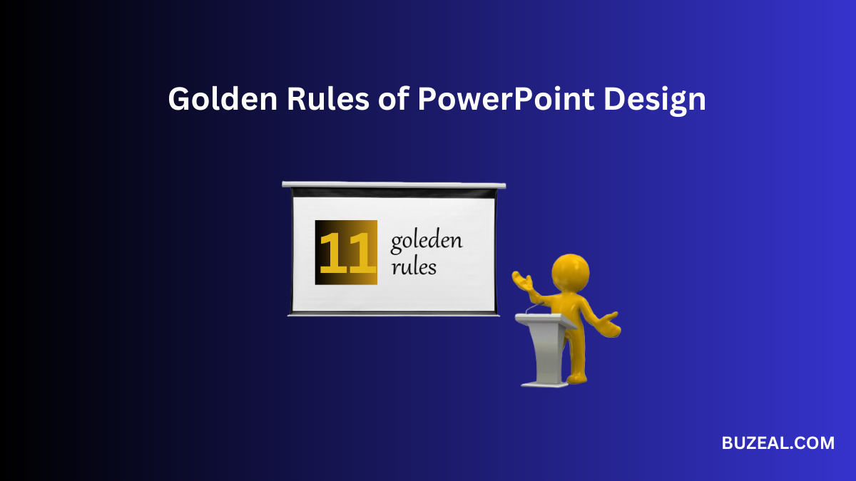
11 Best Golden Rules Of Powerpoint Design
These golden rules are designed to help you create presentations that not only look great but also leave a best impression. Whether you’re new to PowerPoint or want to improve your skills, these tips will guide you in designing slides that effectively convey your message and capture your audience’s attention.
Here are the 11 best Golden Rules of Powerpoint Design,
1. Keep It Simple
The golden rule of presentation design is simplicity. Avoid cluttering slides with too much information. Stick to key points, using bullet points and short sentences. Aim to limit each slide to 6-8 lines of text to ensure readability.
Tip: Focus on one idea per slide. This helps your audience process the information without feeling overwhelmed. Use powerful PPT design tools for better results.
2. Use High-Quality Visuals
Using visuals is a powerful way to communicate complex ideas quickly. Incorporate high-resolution images, graphs, and charts that enhance your message rather than distract from it.
Key considerations:
- Avoid pixelated or stretched images.
- Use visuals that align with your content.
- Add infographics to simplify data-heavy slides.
3. Maintain Consistency
Consistency is crucial for a professional look. Use the same fonts, colors, and layouts throughout your presentation. This creates a good experience for your audience.
Best practices:
- Choose two complementary fonts: one for headers and one for body text.
- Stick to a predefined color palette that aligns with your brand or theme.
4. Prioritize Readability
Ensure your slides are easy to read from a distance. Use large fonts, high-contrast color combinations, and sufficient spacing between text elements.
Guidelines for readability:
- Font size for headers: 30-40 points.
- Font size for body text: 20-24 points.
- Avoid using light text on light backgrounds or dark text on dark backgrounds.
5. Align Elements Neatly
Alignment ensures that your slides look organized and professional. Use grids or guides to position text and visuals accurately.
Alignment tips:
- Left-align text for better readability.
- Center visuals to create balance.
- Maintain equal spacing between elements.
6. Structure Your Presentation Logically
A well-structured presentation flows seamlessly from one slide to the next. Start with an introduction, followed by the main content, and conclude with a summary or call to action.
Structure template:
- Slide 1: Title and introduction.
- Slides 2-5: Key points or sections.
- Final slide: Summary and next steps.
7. Use Animations and Transitions
While animations can enhance a presentation, overusing them can be distracting. Choose subtle and consistent animations to keep the focus on your content.
Dos and don’ts:
- Do use fade or slide-in transitions.
- Don’t use flashy animations like spins or bounces.
- Limit the use of animations to 1-2 per slide.
8. Follow Design Rules (10/20/30 Rule)
Adhering to established presentation rules ensures clarity and engagement. One popular guideline is the 10/20/30 rule:
- Maximum of 10 slides.
- Presentation lasts no longer than 20 minutes.
- Text size is at least 30 points.
This rule keeps your presentation concise and impactful.
9. Apply the 7×7 Rule
The 7×7 rule ensures slides remain clear and digestible:
- Maximum of 7 lines per slide.
- Maximum of 7 words per line.
This prevents information overload and ensures your audience stays focused.
10. Use the 2.4.8 Rule
This time-management rule emphasizes easy communication:
- Spend 2 minutes per slide.
- Use no more than 4 bullet points per slide.
- Limit bullet points to 8 words each.
11. Incorporate the 6×6 Rule
For text-heavy presentations, the 6×6 rule provides a clear framework:
- Maximum of 6 bullet points per slide.
- Maximum of 6 words per bullet point.
This ensures your slides remain visually appealing and easy to follow.
Wrap Up
The best Powerpoint design is about making your ideas clear and engaging. By following these 11 golden rules, you can create presentations that capture attention and make your message stand out. Remember to keep it simple, use high-quality visuals, and maintain consistency throughout. Always prioritize readability, structure your slides logically, and use animations wisely.
By applying these simple guidelines, you’ll be able to deliver powerful presentations that leave a lasting impression on your audience.
So, next time you create a presentation, keep these rules in mind, and watch your ideas shine!. If you need help contact Buzeal Team.
Read More: 10 Common Presentation Design Mistakes and How to Avoid Them
FAQs About PowerPoint Design
1. Why is simplicity important in PowerPoint design?
Simplicity ensures that your audience can focus on the key message without being distracted by unnecessary elements. Clear slides are easier to understand and remember.
2. How do I choose the right visuals for my presentation?
Select visuals that are relevant, high-quality, and support your content. Avoid using generic stock images that don’t add value to your message.
3. What’s the ideal font size for a PowerPoint presentation?
Use a font size of at least 30 points for headers and 20-24 points for body text to ensure readability from a distance.
4. How can I make my slides look professional?
Maintain consistency in fonts, colors, and layouts. Align elements neatly and use a predefined theme to give your presentation a polished look.
5. Are animations necessary in PowerPoint presentations?
Animations can increase engagement when used regularly, but be careful not to overuse them, as they may become distracting.